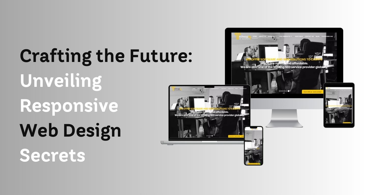
In today’s digital age, where users access the web through a plethora of devices, building responsive web applications has become paramount. Responsive web applications adapt to various screen sizes and resolutions, ensuring a seamless user experience across desktops, laptops, tablets, and smartphones. In this blog post, we will explore the essential design principles and techniques behind building responsive web applications.
Understanding Responsive Web Design
Responsive web design (RWD) is the foundation upon which responsive web applications are built. RWD is an approach that enables web developers to create flexible and adaptive websites that automatically adjust their layout and content based on the user’s device. The key components of responsive web design include fluid grids, flexible images, and media queries.
Fluid Grids and Flexible Layouts
Fluid grids are the backbone of responsive web design. Instead of using fixed pixel measurements for layout, web developers use relative units like percentages or viewport-relative units to size elements proportionally. This ensures that the layout adapts smoothly to different screen sizes.
Flexible Images and Media
Images and media elements need special attention in responsive web applications. Using the max-width: 100% CSS property, images can scale proportionally to fit their parent container. Additionally, the picture and srcset attributes in HTML allow developers to provide multiple versions of an image and let the browser choose the appropriate one based on the device’s resolution.
Media Queries
Media queries enable developers to apply different styles based on the user’s device characteristics such as screen size, resolution, and orientation. By using media queries, the web application can adjust its layout, font sizes, and other design elements to provide an optimal viewing experience.
Mobile-First Approach
A mobile-first approach is a design strategy where the web application is initially designed for mobile devices and then progressively enhanced for larger screens. This approach ensures that the application’s core functionality and content are accessible to users on smaller screens, leading to a better overall user experience.
Touch-friendly Interactions
Responsive web designs should consider touch-friendly interactions, as many users access the web through touch-based devices. Implementing larger tap targets, swipe gestures, and avoiding hover-only interactions can enhance the usability of the application on touch screens.
Performance Optimization
Building responsive web applications involves optimizing performance to ensure fast loading times and smooth user interactions. Techniques such as lazy loading of images, minification and compression of CSS and JavaScript files, and using Content Delivery Networks (CDNs) can significantly improve the application’s performance across various devices and network conditions.
Cross-Browser Compatibility
Ensuring cross-browser compatibility is vital in building responsive web applications. Different browsers may interpret CSS and HTML rules differently, affecting the application’s appearance and functionality. Regular testing across major browsers and devices is essential to deliver a consistent experience to all users.
Testing and Debugging
Thorough testing and debugging are crucial stages in the development process. Using browser developer tools, emulators, and real devices for testing can help identify and fix issues related to responsiveness. Regular user testing and feedback can also provide valuable insights into improving the application’s responsiveness.
To Sum Up
Building responsive web applications is a must in today’s diverse and dynamic digital landscape. By following the design principles and techniques outlined in this blog post, developers can create web applications that provide an exceptional user experience across various devices and screen sizes. Embracing responsive web design not only enhances usability and accessibility but also improves the overall success and user satisfaction of the application.
Whats up very nice blog!! Man .. Excellent .. Wonderful .. I’ll bookmark
your blog and take the feeds also? I’m satrisfied to find numerous helpful information right here within the post, we
need develop more techniques on his regard, thanks for sharing.
It is really a nice and helpful post. Thanks for sharing it.